The Recall Record
A weekly visual record of US product recalls that turns 9,900 government notices into one clear finding, and says out loud what the number cannot prove.
- Role
- Design + build, solo
- Source
- CPSC Recalls API, US public domain
- Refresh
- Weekly, automated, fails rather than publishes
- Status
- Live at recallrecord.com
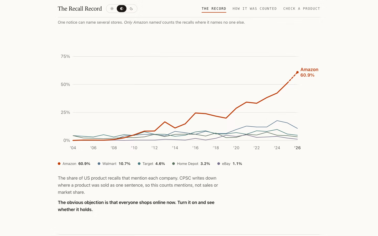
The federal government publishes every consumer product recall as prose, one press release at a time, going back to 1973. Read as a whole instead of one at a time, it says something nobody had put on a chart: in 2004 not one of the 278 recalls that year named Amazon as the only place you could buy the product, and this year it is close to half. The site makes that visible, and it is equally direct about what the number is not.
the key decisionThe finding is only worth publishing if the caveat is as loud as the headline: this counts recalls whose retailer sentence names a store, not units sold and not market share, and the site says so on its face instead of burying it in a footnote.
The problem
Recall notices are written to be read one at a time, so the pattern across 9,900 of them is invisible to the person it affects. The job was to make two decades of prose legible in a single glance without flattening the nuance that makes it honest.
Trust is the design
A number this striking invites doubt, so the page addresses it head on. The obvious objection, that e-commerce simply grew, is a control the reader can switch on to see the comparison. The methodology sits in its own section written in plain language rather than hidden in fine print, and the site states in its own voice that this measures mentions in a retailer sentence, not sales.
Editorial, not dashboard
The finding leads at headline size in a serif face. The chart sits underneath, quiet by comparison, one line pulling away from a flat field. The whole palette is authored in OKLCH so a single perceptual ramp serves both light and dark without a second set of values.
The instruction that was never shown
The lookup told a person their product was recalled, what the hazard was, and how many units shipped. It did not tell them to stop using it, or that a refund existed. CPSC publishes that instruction on every recall since 2020 and the field had never been read. It is now the first thing in an opened row, with the remedy named as a word: refund, repair, replace. The full instruction ships for the listed recalls; a search result carries the tag and links out, because the prose across the whole corpus is roughly 3MB and most searches never read it.
What the data actually allowed
A companion lookup lets someone check a specific product, and its shape was decided by measuring the corpus rather than sketching. Barcode scanning was the obvious feature and the data killed it: only about 3.5% of recent recalls carry a UPC at all, and model, description, and category fields are empty across the board. Names are the only real handle, and they are prose written by a press officer, so the search had to be built around that reality instead of the one that would have been easier to design.
The result is a piece of data journalism that survives its own objections. The obvious rebuttal, that everyone shops online now, is built into the page as a toggle so a reader can test it instead of taking his word for it. It rebuilds weekly on its own, and the build fails loudly rather than shipping numbers that quietly went stale.