The Wet Plant
An interactive 3D map of the roughly 700 submarine cables that carry the internet, with a live outage signal joined to the countries they land in.
- Role
- Design + build, solo
- Data
- TeleGeography, CC BY-NC-SA (non-commercial)
- Refresh
- Weekly, automated, fails rather than ships
- Status
- Live at the-wet-plant.vercel.app
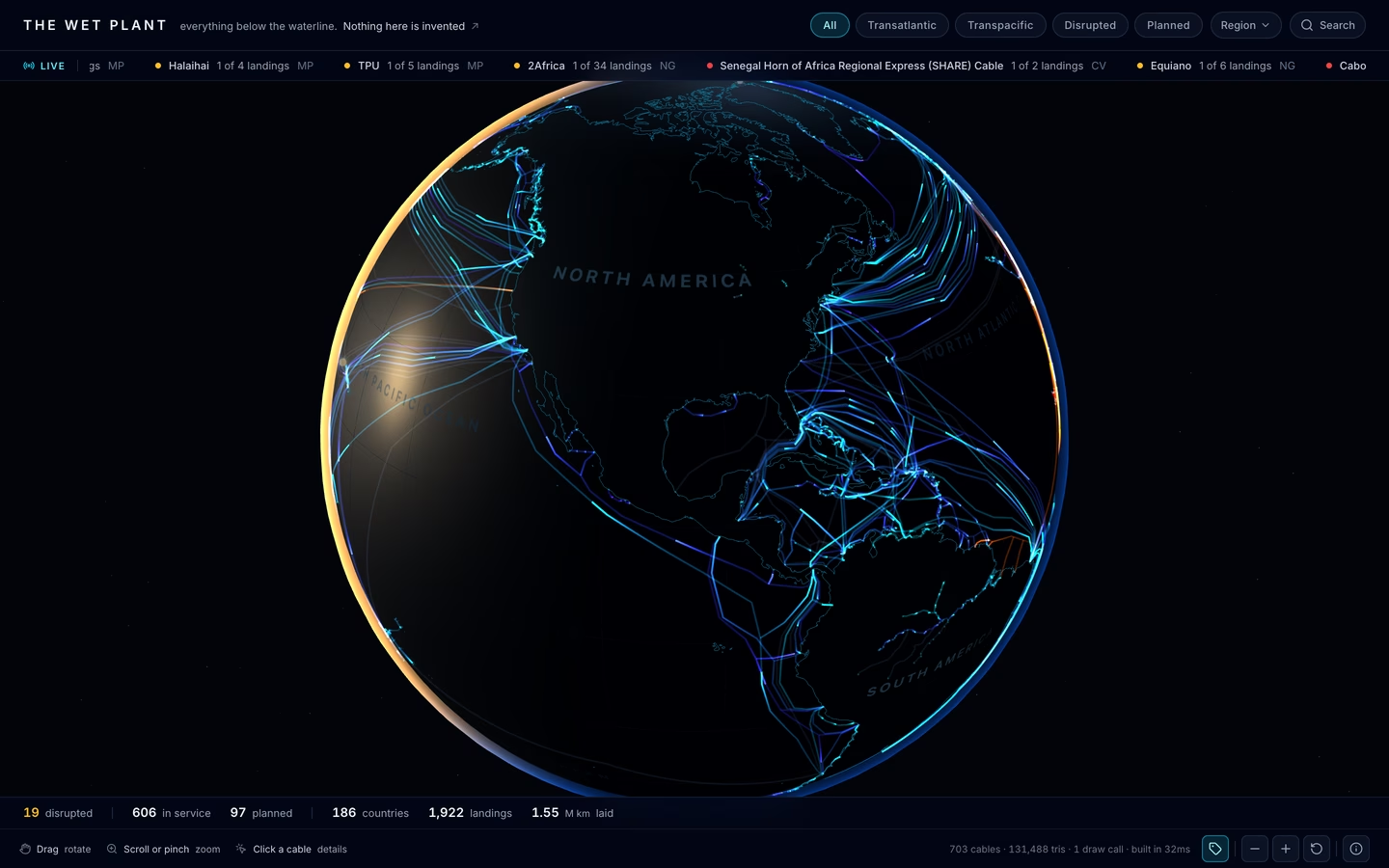
The wet plant is the industry's name for everything in a submarine cable system that sits underwater: the cable, the repeaters, the branching units. Around 700 of them carry the internet between continents, and no map showed them the way an operator would actually think about them. This one does: a 3D globe of every cable, with its owners, its length, and every country it lands in, plus a live outage signal on top. Spin it, filter it, and click any cable to pull up its record.
the key decisionNothing on it is invented. An earlier build showed simulated throughput per cable. The numbers looked good but Paul couldn't defend them, added up across the fleet they came to about fifteen times all the real bandwidth on Earth, so they came out. A labeled fake that wrong is worse than no number at all.
The idea
The real record of a cable is already worth reading: who owns it, how long it is, when it went into service, every country it touches. The problem is it's scattered and flat. The globe puts the cables on the actual planet as physical infrastructure, and shows an outage in context instead of as a headline with no map.
Honest about the data
Every figure is labeled by where it comes from. Routes, owners, lengths, and landing stations are measured, from TeleGeography. The outage layer is real country-level reachability data, joined to the countries each cable lands in. Round-trip time is modeled from each cable's real length, and it says so. The one place the map could mislead, a disrupted landing doesn't prove that cable is broken, is written into the interface, not buried in a footnote.
Cutting the demo to keep it honest
Cutting the fake throughput made it less flashy, but Paul couldn't stand behind those numbers. Planned cables were also split out from the ones in service, because folding them into the total pushed it past what's actually in the water. Split apart, the in-service length matches what TeleGeography publishes. Lumped together, it was off by hundreds of thousands of kilometers.
The point was to make 700 cables feel like the physical system they are, without claiming more than the data backs up. The 3D wasn't the hard part. Working out what could honestly be claimed from data written as prose instead of numbers was, and cutting the parts Paul couldn't stand behind.